

DOI issue:
No. 1 (April, 1893)
DOI article:Designing for bookplates, [1]: with some recent examples
DOI Page / Citation link: https://doi.org/10.11588/diglit.17188#0045


Designing for Book-plates
book-plate, experience shows that some obedience
to artistic convention is essential. If a definite
style be chosen—Rococo, Gothic, Italian, modern
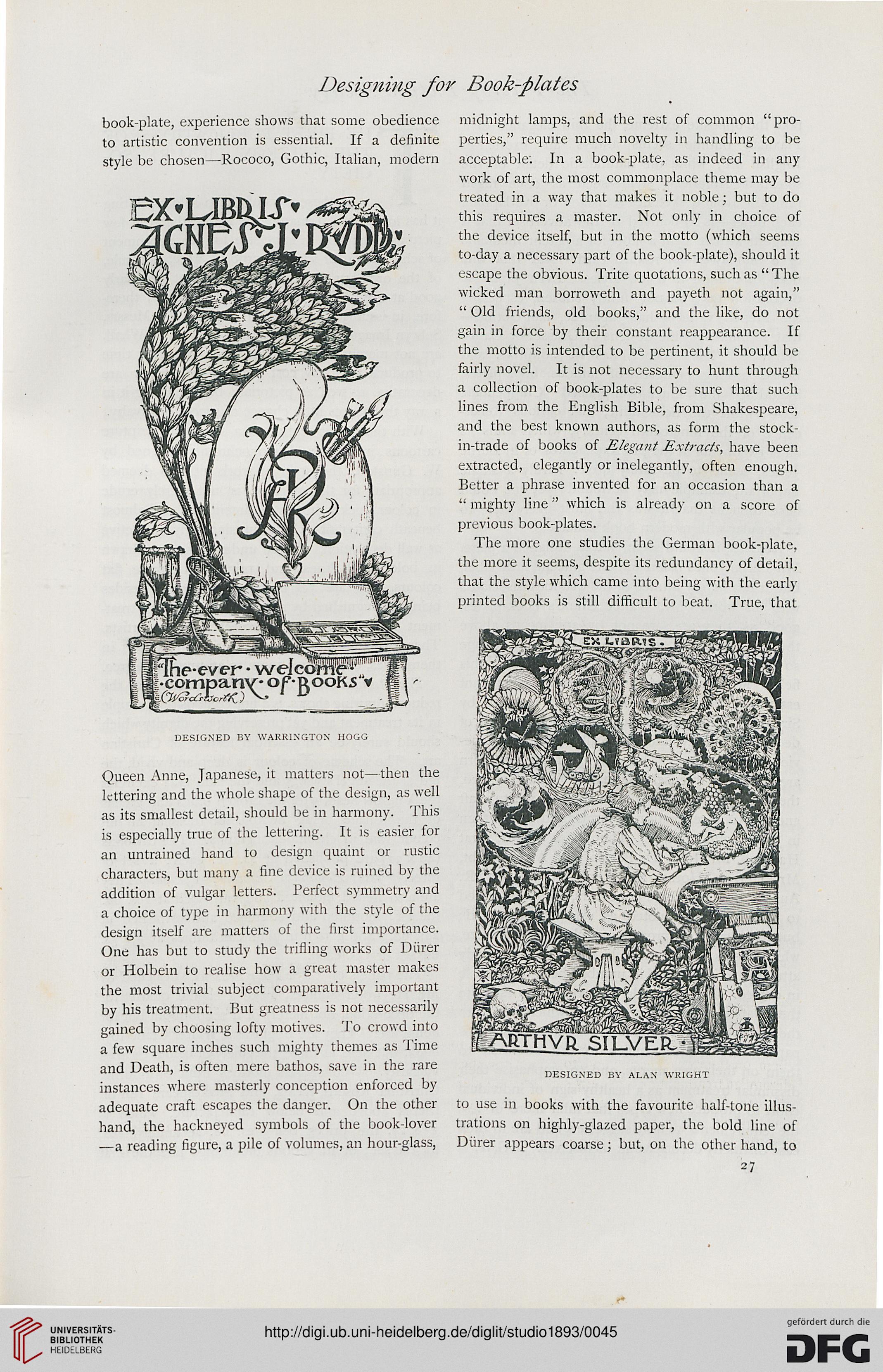
DESIGNED BY WARRINGTON HOGG
Queen Anne, Japanese, it matters not—then the
lettering and the whole shape of the design, as well
as its smallest detail, should be in harmony. This
is especially true of the lettering. It is easier for
an untrained hand to design quaint or rustic
characters, but many a fine device is ruined by the
addition of vulgar letters. Perfect symmetry and
a choice of type in harmony with the style of the
design itself are matters of the first importance.
One has but to study the trifling works of Diirer
or Holbein to realise how a great master makes
the most trivial subject comparatively important
by his treatment. But greatness is not necessarily
gained by choosing lofty motives. To crowd into
a few square inches such mighty themes as Time
and Death, is often mere bathos, save in the rare
instances where masterly conception enforced by
adequate craft escapes the danger. On the other
hand, the hackneyed symbols of the book-lover
—a reading figure, a pile of volumes, an hour-glass,
midnight lamps, and the rest of common "pro-
perties," require much novelty in handling to be
acceptable. In a book-plate, as indeed in any
work of art, the most commonplace theme may be
treated in a way that makes it noble; but to do
this requires a master. Not only in choice of
the device itself, but in the motto (which seems
to-day a necessary part of the book-plate), should it
escape the obvious. Trite quotations, such as " The
wicked man borroweth and payeth not again,"
" Old friends, old books," and the like, do not
gain in force by their constant reappearance. If
the motto is intended to be pertinent, it should be
fairly novel. It is not necessary to hunt through
a collection of book-plates to be sure that such
lines from the English Bible, from Shakespeare,
and the best known authors, as form the stock-
in-trade of books of Elegant Extracts, have been
extracted, elegantly or inelegantly, often enough.
Better a phrase invented for an occasion than a
" mighty line" which is already on a score of
previous book-plates.
The more one studies the German book-plate,
the more it seems, despite its redundancy of detail,
that the style which came into being with the early-
printed books is still difficult to beat. True, that
DESIGNED BY ALAN WRIGHT
to use in books with the favourite half-tone illus-
trations on highly-glazed paper, the bold line of
Diirer appears coarse; but, on the other hand, to
27
book-plate, experience shows that some obedience
to artistic convention is essential. If a definite
style be chosen—Rococo, Gothic, Italian, modern
DESIGNED BY WARRINGTON HOGG
Queen Anne, Japanese, it matters not—then the
lettering and the whole shape of the design, as well
as its smallest detail, should be in harmony. This
is especially true of the lettering. It is easier for
an untrained hand to design quaint or rustic
characters, but many a fine device is ruined by the
addition of vulgar letters. Perfect symmetry and
a choice of type in harmony with the style of the
design itself are matters of the first importance.
One has but to study the trifling works of Diirer
or Holbein to realise how a great master makes
the most trivial subject comparatively important
by his treatment. But greatness is not necessarily
gained by choosing lofty motives. To crowd into
a few square inches such mighty themes as Time
and Death, is often mere bathos, save in the rare
instances where masterly conception enforced by
adequate craft escapes the danger. On the other
hand, the hackneyed symbols of the book-lover
—a reading figure, a pile of volumes, an hour-glass,
midnight lamps, and the rest of common "pro-
perties," require much novelty in handling to be
acceptable. In a book-plate, as indeed in any
work of art, the most commonplace theme may be
treated in a way that makes it noble; but to do
this requires a master. Not only in choice of
the device itself, but in the motto (which seems
to-day a necessary part of the book-plate), should it
escape the obvious. Trite quotations, such as " The
wicked man borroweth and payeth not again,"
" Old friends, old books," and the like, do not
gain in force by their constant reappearance. If
the motto is intended to be pertinent, it should be
fairly novel. It is not necessary to hunt through
a collection of book-plates to be sure that such
lines from the English Bible, from Shakespeare,
and the best known authors, as form the stock-
in-trade of books of Elegant Extracts, have been
extracted, elegantly or inelegantly, often enough.
Better a phrase invented for an occasion than a
" mighty line" which is already on a score of
previous book-plates.
The more one studies the German book-plate,
the more it seems, despite its redundancy of detail,
that the style which came into being with the early-
printed books is still difficult to beat. True, that
DESIGNED BY ALAN WRIGHT
to use in books with the favourite half-tone illus-
trations on highly-glazed paper, the bold line of
Diirer appears coarse; but, on the other hand, to
27