

DOI Heft:
No. 5 (August, 1893)
DOI Artikel:Hogg, Warrington: Letters from artists to artists, [4]: some cottage tablets by a decorative artist on the tramp
DOI Artikel:Awards in the title-page competition
DOI Seite / Zitierlink: https://doi.org/10.11588/diglit.17188#0222


Some Cottage Tablets
Here is a very simple one, out of a number to be
seen at Minster, which has just the letters T. E.
rudely carved, and a date 1717, apparently wedged
in as an afterthought. Still I fancy you will agree
- >
with me that the little panel is, as a whole, simple,
direct, and pleasant.
It was enjoyable coming across the name of
" Weller." Would that I could truthfully say that
it is " Samivel " and not " John " that is carved on
the little panel which is to be found on the west
face of the church tower at Wye (Kent) hard
over the doorway. However, there it is, " IOHN
WELLER," and the date 1725, and is one, amongst
a considerable number, of curious tablets of the
usual cottage type, but exceptional and remarkable
when found on a church exterior. It would seem
at any rate quite possible to imagine that Charles
Dickens in his wanderings may have seen these
very tablets (for Wye, as you know, is not far from
his old home, Rochester). The name "Weller"
may have struck him as being unusual—he may
have noted it down and eventually wrought it into
his immortal " Pickwick "—who knows ?
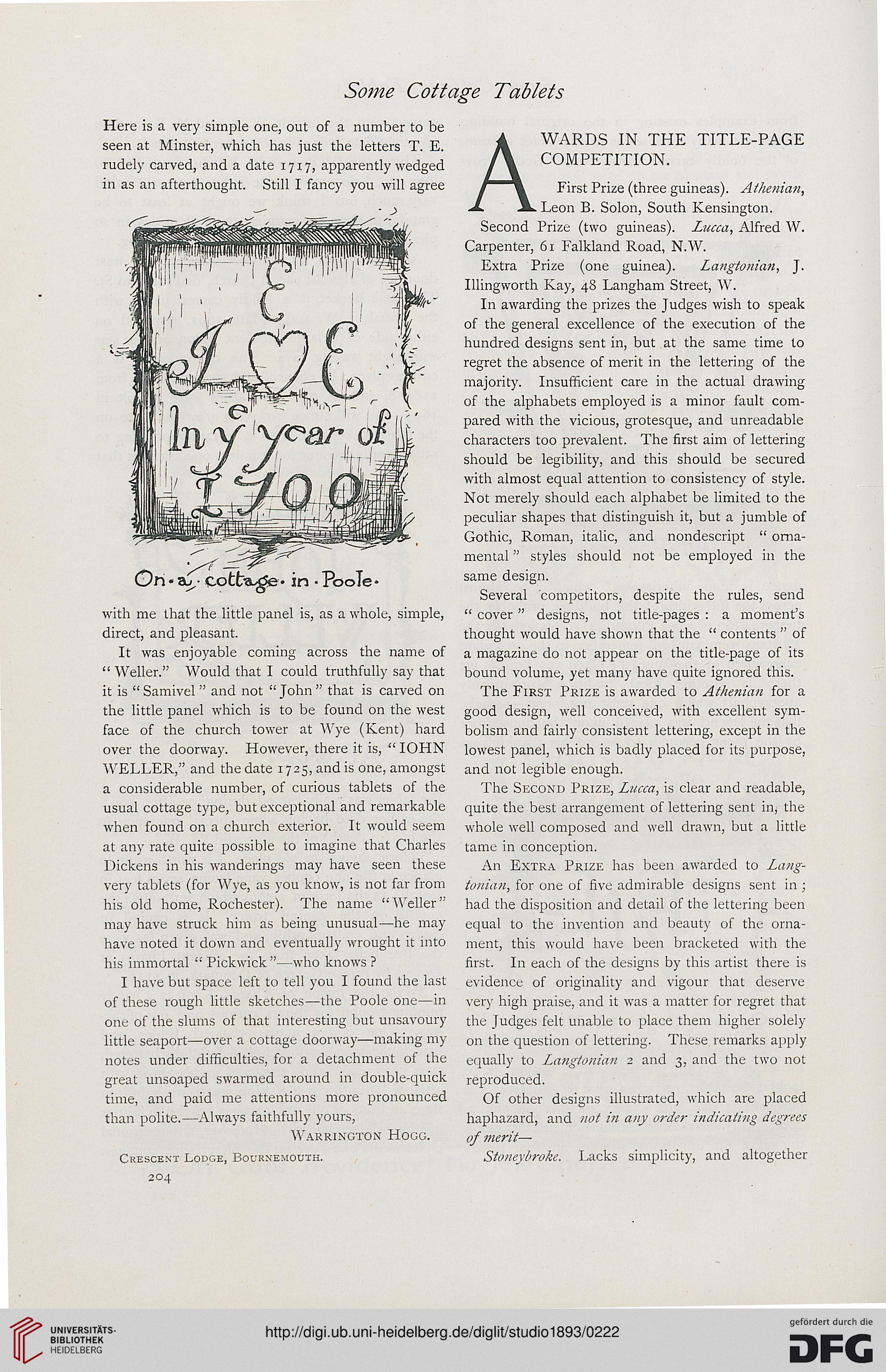
I have but space left to tell you I found the last
of these rough little sketches—the Poole one—in
one of the slums of that interesting but unsavoury
little seaport—over a cottage doorway—making my
notes under difficulties, for a detachment of the
great unsoaped swarmed around in double-quick
time, and paid me attentions more pronounced
than polite.—Always faithfully yours,
Warrington Hogg.
Crescent Lodge, Bournemouth.
204
WARDS IN THE TITLE-PAGE
COMPETITION.
First Prize (three guineas). Athenian,
Leon B. Solon, South Kensington.
Second Prize (two guineas). Lucca, Alfred W.
Carpenter, 61 Falkland Road, N.W.
Extra Prize (one guinea). Langtonian, J.
Illingworth Kay, 48 Langham Street, W.
In awarding the prizes the Judges wish to speak
of the general excellence of the execution of the
hundred designs sent in, but at the same time to
regret the absence of merit in the lettering of the
majority. Insufficient care in the actual drawing
of the alphabets employed is a minor fault com-
pared with the vicious, grotesque, and unreadable
characters too prevalent. The first aim of lettering
should be legibility, and this should be secured
with almost equal attention to consistency of style.
Not merely should each alphabet be limited to the
peculiar shapes that distinguish it, but a jumble of
Gothic, Roman, italic, and nondescript " orna-
mental " styles should not be employed in the
same design.
Several competitors, despite the rules, send
" cover" designs, not title-pages : a moment's
thought would have shown that the " contents " of
a magazine do not appear on the title-page of its
bound volume, yet many have quite ignored this.
The First Prize is awarded to Athenian for a
good design, well conceived, with excellent sym-
bolism and fairly consistent lettering, except in the
lowest panel, which is badly placed for its purpose,
and not legible enough.
The Second Prize, Lucca, is clear and readable,
quite the best arrangement of lettering sent in, the
whole well composed and well drawn, but a little
tame in conception.
An Extra Prize has been awarded to Lang-
tonian, for one of five admirable designs sent in ;
had the disposition and detail of the lettering been
equal to the invention and beauty of the orna-
ment, this would have been bracketed with the
first. In each of the designs by this artist there is
evidence of originality and vigour that deserve
very high praise, and it was a matter for regret that
the Judges felt unable to place them higher solely
on the question of lettering. These remarks apply
equally to Langtonian 2 and 3, and the two not
reproduced.
Of other designs illustrated, which are placed
haphazard, and not in any order indicating degrees
of merit—
Stoneybroke. Lacks simplicity, and altogether
Here is a very simple one, out of a number to be
seen at Minster, which has just the letters T. E.
rudely carved, and a date 1717, apparently wedged
in as an afterthought. Still I fancy you will agree
- >
with me that the little panel is, as a whole, simple,
direct, and pleasant.
It was enjoyable coming across the name of
" Weller." Would that I could truthfully say that
it is " Samivel " and not " John " that is carved on
the little panel which is to be found on the west
face of the church tower at Wye (Kent) hard
over the doorway. However, there it is, " IOHN
WELLER," and the date 1725, and is one, amongst
a considerable number, of curious tablets of the
usual cottage type, but exceptional and remarkable
when found on a church exterior. It would seem
at any rate quite possible to imagine that Charles
Dickens in his wanderings may have seen these
very tablets (for Wye, as you know, is not far from
his old home, Rochester). The name "Weller"
may have struck him as being unusual—he may
have noted it down and eventually wrought it into
his immortal " Pickwick "—who knows ?
I have but space left to tell you I found the last
of these rough little sketches—the Poole one—in
one of the slums of that interesting but unsavoury
little seaport—over a cottage doorway—making my
notes under difficulties, for a detachment of the
great unsoaped swarmed around in double-quick
time, and paid me attentions more pronounced
than polite.—Always faithfully yours,
Warrington Hogg.
Crescent Lodge, Bournemouth.
204
WARDS IN THE TITLE-PAGE
COMPETITION.
First Prize (three guineas). Athenian,
Leon B. Solon, South Kensington.
Second Prize (two guineas). Lucca, Alfred W.
Carpenter, 61 Falkland Road, N.W.
Extra Prize (one guinea). Langtonian, J.
Illingworth Kay, 48 Langham Street, W.
In awarding the prizes the Judges wish to speak
of the general excellence of the execution of the
hundred designs sent in, but at the same time to
regret the absence of merit in the lettering of the
majority. Insufficient care in the actual drawing
of the alphabets employed is a minor fault com-
pared with the vicious, grotesque, and unreadable
characters too prevalent. The first aim of lettering
should be legibility, and this should be secured
with almost equal attention to consistency of style.
Not merely should each alphabet be limited to the
peculiar shapes that distinguish it, but a jumble of
Gothic, Roman, italic, and nondescript " orna-
mental " styles should not be employed in the
same design.
Several competitors, despite the rules, send
" cover" designs, not title-pages : a moment's
thought would have shown that the " contents " of
a magazine do not appear on the title-page of its
bound volume, yet many have quite ignored this.
The First Prize is awarded to Athenian for a
good design, well conceived, with excellent sym-
bolism and fairly consistent lettering, except in the
lowest panel, which is badly placed for its purpose,
and not legible enough.
The Second Prize, Lucca, is clear and readable,
quite the best arrangement of lettering sent in, the
whole well composed and well drawn, but a little
tame in conception.
An Extra Prize has been awarded to Lang-
tonian, for one of five admirable designs sent in ;
had the disposition and detail of the lettering been
equal to the invention and beauty of the orna-
ment, this would have been bracketed with the
first. In each of the designs by this artist there is
evidence of originality and vigour that deserve
very high praise, and it was a matter for regret that
the Judges felt unable to place them higher solely
on the question of lettering. These remarks apply
equally to Langtonian 2 and 3, and the two not
reproduced.
Of other designs illustrated, which are placed
haphazard, and not in any order indicating degrees
of merit—
Stoneybroke. Lacks simplicity, and altogether