

DOI Heft:
No. 5 (August, 1893)
DOI Artikel:Awards in the title-page competition
DOI Seite / Zitierlink: https://doi.org/10.11588/diglit.17188#0224


Awards in the Title-Page Competition
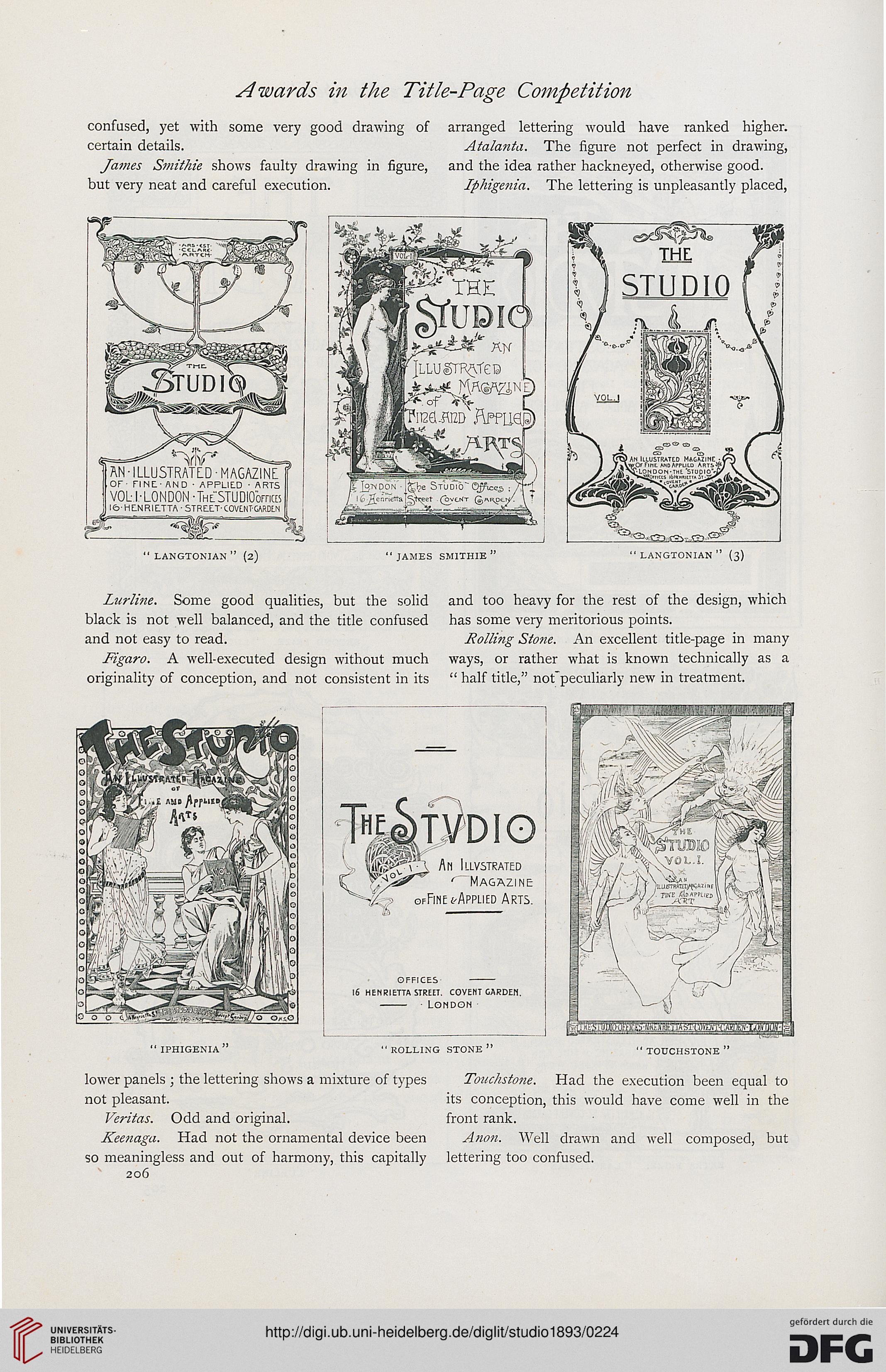
confused, yet with some very good drawing of arranged lettering would have ranked higher,
certain details. Atalanta. The figure not perfect in drawing,
James Smithie shows faulty drawing in figure, and the idea rather hackneyed, otherwise good,
but very neat and careful execution. Iphigenia. The lettering is unpleasantly placed,
" langtonian " (2) " james smithie " " langtonian " (3)
Lurline. Some good qualities, but the solid and too heavy for the rest of the design, which
black is not well balanced, and the title confused has some very meritorious points,
and not easy to read. Rolling Sto?ie. An excellent title-page in many
Figaro. A well-executed design without much ways, or rather what is known technically as a
originality of conception, and not consistent in its " half title," not'peculiarly new in treatment.
> fp^-'l AM ILLV5TRATED
y^°^r" < Magazine
^> ofFine ('Applied Arts.
la •-
offices -
16 henrietta street. covelit garden.
- London
"iphigenia" " rolling stone " "touchstone"
lower panels ; the lettering shows a mixture of types Touchstone. Had the execution been equal to
not pleasant. its conception, this would have come well in the
Veritas. Odd and original. front rank.
Keenaga. Had not the ornamental device been Anon. Well drawn and well composed, but
so meaningless and out of harmony, this capitally lettering too confused.
206