

DOI Heft:
No. 5 (August, 1893)
DOI Artikel:Awards in the title-page competition
DOI Seite / Zitierlink: https://doi.org/10.11588/diglit.17188#0225


Awards in the Title-Page Competition
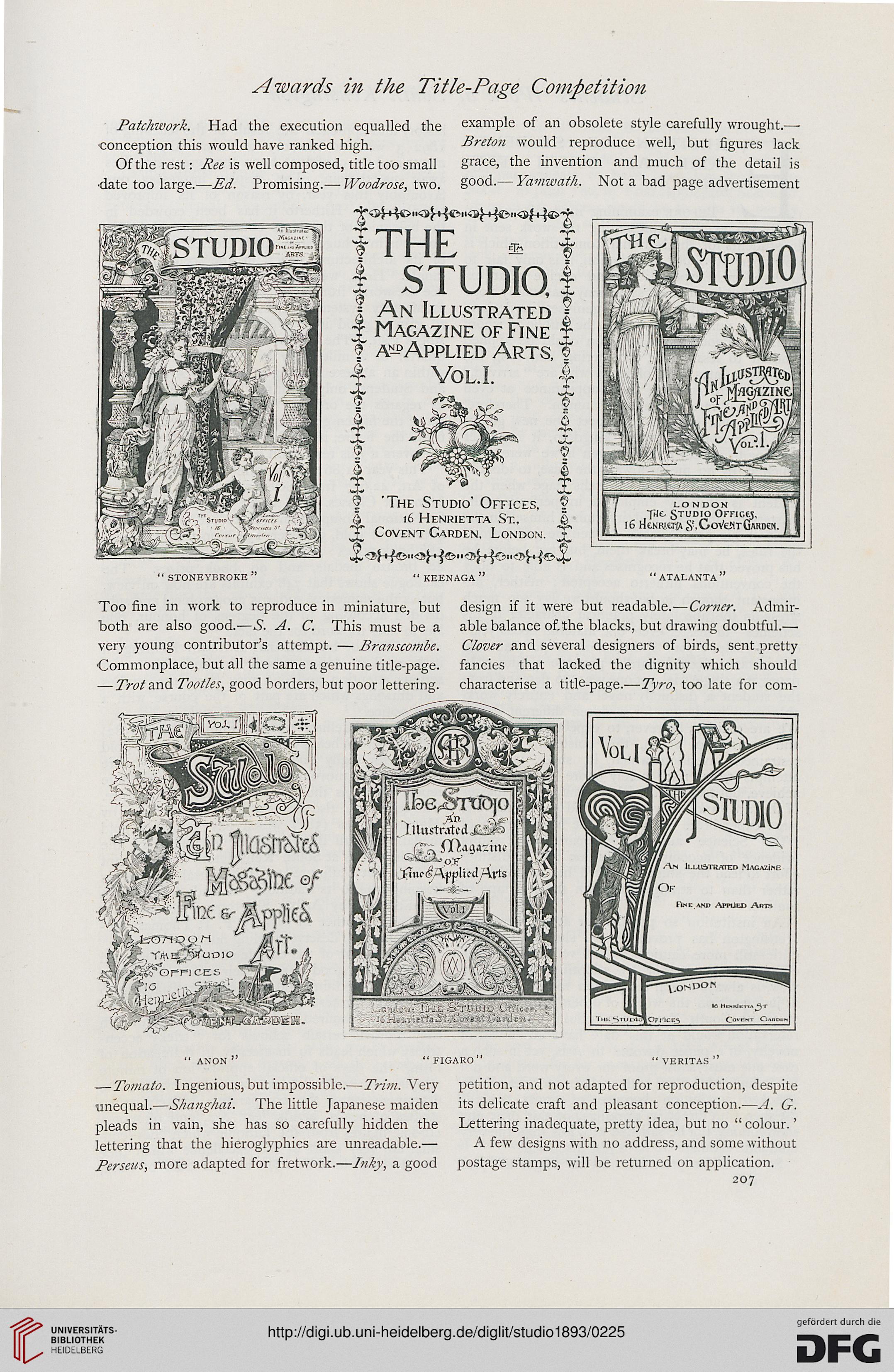
Patchwork. Had the execution equalled the example of an obsolete style carefully wrought—
conception this would have ranked high. Breton would reproduce well, but figures lack
Of the rest: Pee is well composed, title too small grace. the invention and much of the detail is
•date too large.— Ed. Promising.— Woodrose, two. good.— Yamwath. Not a bad page advertisement
THE * i
j STUDIO, |
I An Illustrated |
t Magazine of Fine t
j a^-dApplied Arts, ©
4 vol.i. 4
london
fAc Studio Officer,
16 rtfcNKltllAS.GoVeitTGAKDeN.
*
i
i
f 'The Studio' Offices, f
$ 16 Henrietta St., ©
2£ Covent Carden, London.
" stoneybroke " " keenaga " " atalanta "
Too fine in work to reproduce in miniature, but design if it were but readable.—Corner. Admir-
both are also good.—S. A. C. This must be a able balance of. the blacks, but drawing doubtful.—
very young contributor's attempt. — Branscombe. Clover and several designers of birds, sent pretty
Commonplace, but all the same a genuine title-page, fancies that lacked the dignity which should
— Trot and Tootles, good borders, but poor lettering, characterise a title-page.—Tyro, too late for com-
> W/A, M^lX of
S3*
34. 5t;fp«**t &
r""'' 1
anon" "figaro" " veritas "
—Tomato. Ingenious, but impossible.—Trim. Very petition, and not adapted for reproduction, despite
unequal.—Shanghai. The little Japanese maiden its delicate craft and pleasant conception.—A. G.
pleads in vain, she has so carefully hidden the Lettering inadequate, pretty idea, but no " colour.'
lettering that the hieroglyphics are unreadable.— A few designs with no address, and some without
Perseus, more adapted for fretwork.—Inky, a good postage stamps, will be returned on application.
207