

DOI Heft:
No. 29 (August, 1895)
DOI Artikel:White, Gleeson: The making of monograms
DOI Seite / Zitierlink: https://doi.org/10.11588/diglit.17294#0205


The Making of Monograms
their chaste beauty at its best becomes tedious by
repetition. Many other types suggest themselves
without venturing into unbridled eccentricity.
Roman letters, whether simply placed together, as
in the well-known signature of Albrecht Diirer, or
combined as you find them on many old paintings,
silver-plate, and merchants' marks, are far too
rarely used. In a few instances, these Roman
letters employ an enclosing line, and hence, by
making the whole a definite shape, become at once
the kindred of Egyptian signatures, and Babylonian
seals, and of Japanese and Chinese autographs.
It certainly seems more pleasant that the device
should be in a frame, rather than in the shapeless
form of a vignette, and more in accord with the
idea of decoration which favours our best work at
present.
This preference must, however, be advanced
simply as an expression of personal taste. No vital
principles are at stake ; whether you prefer a com-
bination of letters, subordinated to an enclosing
border, or within the vague outline of a vignette,
is really of little consequence.
The really important item in the matter is the
question of unity of style, be it what it may.
Whatever type you elect to follow or invent, it
should obey certain rules. Its alphabet should be
selected from a distinct period, whether Gothic,
Lombardic, Roman, italic, or script, is a matter of
taste; but it is essential that one type only should
be employed throughout. True, as in the case
of title-pages, a thousand examples of mixtures of
style may be traced to most respectable sources ;
but that does not alter the fact that a mixture of
styles results in no style at all; the effect may not
be unpleasing, but it is certain to lack distinction.
The most eccentric and grotesque monogram, where
each letter is lawless and absolutely a bastard type,
is preferable to an orderly and dignified mediaeval
M intriguing with a severe Roman T.
Of course one must not be too exact in insisting
upon rigid accuracy in each initial. The very fact
that letters of equal size, or thereabouts, must be
so interwoven that each one although clearly seen
falls into a symmetrical pattern, prevents our keep-
ing to the strict proportions that should, and do as
a rule, govern the printed alphabet. Therefore
it may be quite impossible to follow the purest
forms of the letters at times ; but such exaggeration
as the design requires should, if possible, be kept to
the non-essential portions, the serifs and flourishes
of the letter rather than its main lines; or these, if
they must be modified, can still keep the spirit of
the original.
186
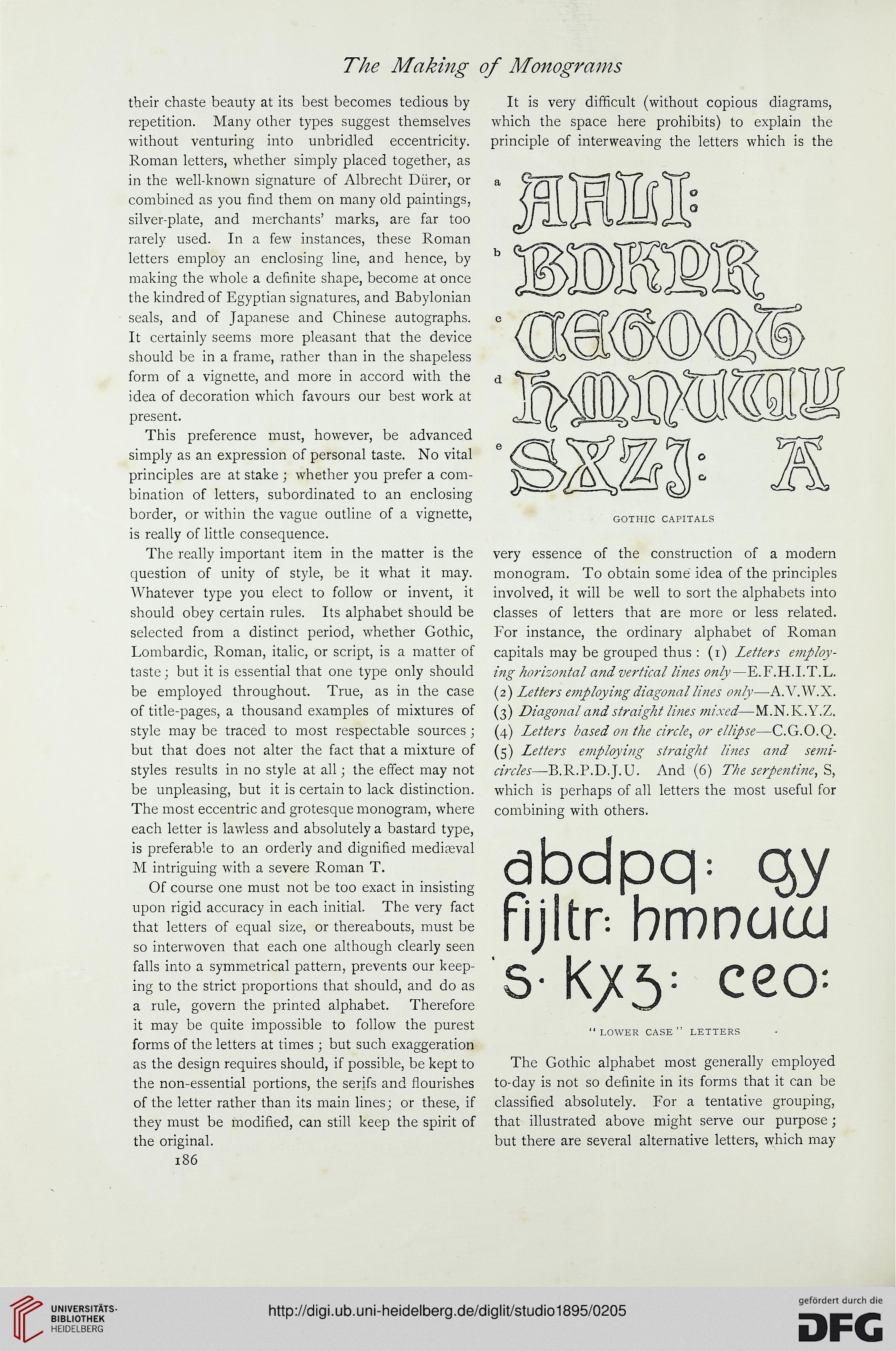
It is very difficult (without copious diagrams,
which the space here prohibits) to explain the
principle of interweaving the letters which is the
GOTHIC CAPITALS
very essence of the construction of a modern
monogram. To obtain some idea of the principles
involved, it will be well to sort the alphabets into
classes of letters that are more or less related.
For instance, the ordinary alphabet of Roman
capitals may be grouped thus : (i) Letters employ-
ing horizontal and vertical lines only—E.F.H.I.T.L.
(2) Letters employing diagonal lines only—A.V.W.X.
(3) Diagonal and straight lines mixed—M.N.K.Y.Z.
(4) Letters based on the circle, or ellipse—C.G.O.Q.
(5) Letters employing straight lines and semi-
circles—B.R.P.D.J. U. And (6) The serpentine, %
which is perhaps of all letters the most useful for
combining with others.
abdpq: qy
ftjltn bmnuoj
s- ceo-
" LOWER CASE " LETTERS
The Gothic alphabet most generally employed
to-day is not so definite in its forms that it can be
classified absolutely. For a tentative grouping,
that illustrated above might serve our purpose;
but there are several alternative letters, which may
their chaste beauty at its best becomes tedious by
repetition. Many other types suggest themselves
without venturing into unbridled eccentricity.
Roman letters, whether simply placed together, as
in the well-known signature of Albrecht Diirer, or
combined as you find them on many old paintings,
silver-plate, and merchants' marks, are far too
rarely used. In a few instances, these Roman
letters employ an enclosing line, and hence, by
making the whole a definite shape, become at once
the kindred of Egyptian signatures, and Babylonian
seals, and of Japanese and Chinese autographs.
It certainly seems more pleasant that the device
should be in a frame, rather than in the shapeless
form of a vignette, and more in accord with the
idea of decoration which favours our best work at
present.
This preference must, however, be advanced
simply as an expression of personal taste. No vital
principles are at stake ; whether you prefer a com-
bination of letters, subordinated to an enclosing
border, or within the vague outline of a vignette,
is really of little consequence.
The really important item in the matter is the
question of unity of style, be it what it may.
Whatever type you elect to follow or invent, it
should obey certain rules. Its alphabet should be
selected from a distinct period, whether Gothic,
Lombardic, Roman, italic, or script, is a matter of
taste; but it is essential that one type only should
be employed throughout. True, as in the case
of title-pages, a thousand examples of mixtures of
style may be traced to most respectable sources ;
but that does not alter the fact that a mixture of
styles results in no style at all; the effect may not
be unpleasing, but it is certain to lack distinction.
The most eccentric and grotesque monogram, where
each letter is lawless and absolutely a bastard type,
is preferable to an orderly and dignified mediaeval
M intriguing with a severe Roman T.
Of course one must not be too exact in insisting
upon rigid accuracy in each initial. The very fact
that letters of equal size, or thereabouts, must be
so interwoven that each one although clearly seen
falls into a symmetrical pattern, prevents our keep-
ing to the strict proportions that should, and do as
a rule, govern the printed alphabet. Therefore
it may be quite impossible to follow the purest
forms of the letters at times ; but such exaggeration
as the design requires should, if possible, be kept to
the non-essential portions, the serifs and flourishes
of the letter rather than its main lines; or these, if
they must be modified, can still keep the spirit of
the original.
186
It is very difficult (without copious diagrams,
which the space here prohibits) to explain the
principle of interweaving the letters which is the
GOTHIC CAPITALS
very essence of the construction of a modern
monogram. To obtain some idea of the principles
involved, it will be well to sort the alphabets into
classes of letters that are more or less related.
For instance, the ordinary alphabet of Roman
capitals may be grouped thus : (i) Letters employ-
ing horizontal and vertical lines only—E.F.H.I.T.L.
(2) Letters employing diagonal lines only—A.V.W.X.
(3) Diagonal and straight lines mixed—M.N.K.Y.Z.
(4) Letters based on the circle, or ellipse—C.G.O.Q.
(5) Letters employing straight lines and semi-
circles—B.R.P.D.J. U. And (6) The serpentine, %
which is perhaps of all letters the most useful for
combining with others.
abdpq: qy
ftjltn bmnuoj
s- ceo-
" LOWER CASE " LETTERS
The Gothic alphabet most generally employed
to-day is not so definite in its forms that it can be
classified absolutely. For a tentative grouping,
that illustrated above might serve our purpose;
but there are several alternative letters, which may