

DOI Heft:
No. 29 (August, 1895)
DOI Artikel:White, Gleeson: The making of monograms
DOI Seite / Zitierlink:https://doi.org/10.11588/diglit.17294#0207


The Making of Monograms
combinations ; where you have an embracing letters are clumsy and ineffective, despite the good
letter, as S.G.L.C. or E, combined with others detail that adorns them.
built up from straight lines (whether upright as The cypher monogram, which consists of inter-
H.T., or diagonal as A.V.W.X.Y.), there is little laced letters (frequently reversed for the sake of
difficulty. The real ingenuity is required for a balance), is unquestionably elegant in its best
good treatment of monograms, including F or K,
or L or P; and when three of these lop-sided
letters occur, and occur in such order that the
lines accentuate the lack of symmetry, as in F.F.P.
for instance, or E.L.L., it requires no little experi-
menting to evoke a pleasant balance. Of course,
if the whole is planned within a framing line, and
ornamental details are added, it becomes far easier,
iliu
examples, but also has no little
tendency to weakness. In the
A.E.F. of Fig. 7, the thin
curves form a very undecorative
group, which cannot be said to
be legible ; the two specimens
of Fig. 3 are quite excellent
examples of a better treatment.
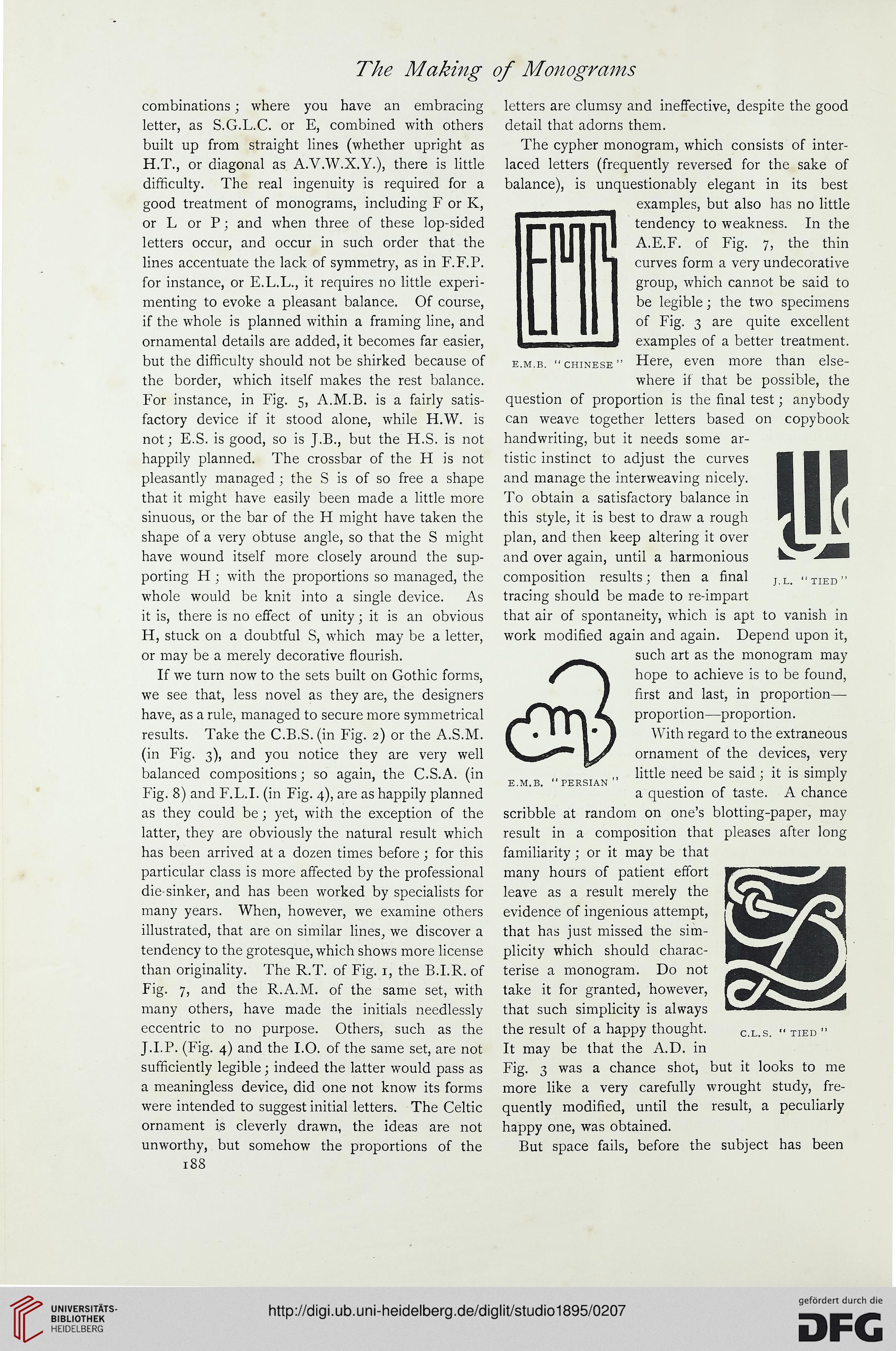
but the difficulty should not be shirked because of e.m.b. "Chinese" Here, even more than else-
the border, which itself makes the rest balance. where if that be possible, the
For instance, in Fig. 5, A.M.B. is a fairly satis- question of proportion is the final test; anybody
factory device if it stood alone, while H.W. is can weave together letters based on copybook
not; E.S. is good, so is J.B., but the H.S. is not handwriting, but it needs some ar-
happily planned. The crossbar of the H is not tistic instinct to adjust the curves
pleasantly managed ; the S is of so free a shape and manage the interweaving nicely,
that it might have easily been made a little more To obtain a satisfactory balance in
sinuous, or the bar of the H might have taken the this style, it is best to draw a rough
shape of a very obtuse angle, so that the S might plan, and then keep altering it over
have wound itself more closely around the sup- and over again, until a harmonious
porting H; with the proportions so managed, the composition results; then a final ] U "tied"
whole would be knit into a single device. As tracing should be made to re-impart
it is, there is no effect of unity; it is an obvious that air of spontaneity, which is apt to vanish in
H, stuck on a doubtful S, which may be a letter, work modified again and again. Depend upon it,
or may be a merely decorative flourish. such art as the monogram may
If we turn now to the sets built on Gothic forms, j ^\ hope to achieve is to be found,
we see that, less novel as they are, the designers 1 first and last, in proportion—
have, as a rule, managed to secure more symmetrical Yy> ^ proportion—proportion,
results. Take the C.B.S. (in Fig. 2) or the A.S.M. |« 1*/ With regard to the extraneous
(in Fig. 3), and you notice they are very well \ J ornament of the devices, very
balanced compositions; so again, the C.S.A. (in ,, little need be said ; it is simply
r ' ° ' x e.m.b. "persian ' irj
Fig. 8) and F.L.I, (in Fig. 4), are as happily planned a question of taste. A chance
as they could be ; yet, with the exception of the scribble at random on one's blotting-paper, may
latter, they are obviously the natural result which result in a composition that pleases after long
has been arrived at a dozen times before ; for this familiarity ; or it may be that
particular class is more affected by the professional many hours of patient effort
die-sinker, and has been worked by specialists for leave as a result merely the
many years. When, however, we examine others evidence of ingenious attempt,
illustrated, that are on similar lines, we discover a that has just missed the sim-
tendency to the grotesque, which shows more license plicity which should charac-
than originality. The R.T. of Fig. 1, the B.I.R. of terise a monogram. Do not
Fig. 7, and the R.A.M. of the same set, with take it for granted, however,
many others, have made the initials needlessly that such simplicity is always
eccentric to no purpose. Others, such as the the result of a happy thought. c.l.s. "tied"
J.I.P. (Fig. 4) and the I.O. of the same set, are not It may be that the A.D. in
sufficiently legible; indeed the latter would pass as Fig. 3 was a chance shot, but it looks to me
a meaningless device, did one not know its forms more like a very carefully wrought study, fre-
were intended to suggest initial letters. The Celtic quently modified, until the result, a peculiarly
ornament is cleverly drawn, the ideas are not happy one, was obtained.
unworthy, but somehow the proportions of the But space fails, before the subject has been
188
combinations ; where you have an embracing letters are clumsy and ineffective, despite the good
letter, as S.G.L.C. or E, combined with others detail that adorns them.
built up from straight lines (whether upright as The cypher monogram, which consists of inter-
H.T., or diagonal as A.V.W.X.Y.), there is little laced letters (frequently reversed for the sake of
difficulty. The real ingenuity is required for a balance), is unquestionably elegant in its best
good treatment of monograms, including F or K,
or L or P; and when three of these lop-sided
letters occur, and occur in such order that the
lines accentuate the lack of symmetry, as in F.F.P.
for instance, or E.L.L., it requires no little experi-
menting to evoke a pleasant balance. Of course,
if the whole is planned within a framing line, and
ornamental details are added, it becomes far easier,
iliu
examples, but also has no little
tendency to weakness. In the
A.E.F. of Fig. 7, the thin
curves form a very undecorative
group, which cannot be said to
be legible ; the two specimens
of Fig. 3 are quite excellent
examples of a better treatment.
but the difficulty should not be shirked because of e.m.b. "Chinese" Here, even more than else-
the border, which itself makes the rest balance. where if that be possible, the
For instance, in Fig. 5, A.M.B. is a fairly satis- question of proportion is the final test; anybody
factory device if it stood alone, while H.W. is can weave together letters based on copybook
not; E.S. is good, so is J.B., but the H.S. is not handwriting, but it needs some ar-
happily planned. The crossbar of the H is not tistic instinct to adjust the curves
pleasantly managed ; the S is of so free a shape and manage the interweaving nicely,
that it might have easily been made a little more To obtain a satisfactory balance in
sinuous, or the bar of the H might have taken the this style, it is best to draw a rough
shape of a very obtuse angle, so that the S might plan, and then keep altering it over
have wound itself more closely around the sup- and over again, until a harmonious
porting H; with the proportions so managed, the composition results; then a final ] U "tied"
whole would be knit into a single device. As tracing should be made to re-impart
it is, there is no effect of unity; it is an obvious that air of spontaneity, which is apt to vanish in
H, stuck on a doubtful S, which may be a letter, work modified again and again. Depend upon it,
or may be a merely decorative flourish. such art as the monogram may
If we turn now to the sets built on Gothic forms, j ^\ hope to achieve is to be found,
we see that, less novel as they are, the designers 1 first and last, in proportion—
have, as a rule, managed to secure more symmetrical Yy> ^ proportion—proportion,
results. Take the C.B.S. (in Fig. 2) or the A.S.M. |« 1*/ With regard to the extraneous
(in Fig. 3), and you notice they are very well \ J ornament of the devices, very
balanced compositions; so again, the C.S.A. (in ,, little need be said ; it is simply
r ' ° ' x e.m.b. "persian ' irj
Fig. 8) and F.L.I, (in Fig. 4), are as happily planned a question of taste. A chance
as they could be ; yet, with the exception of the scribble at random on one's blotting-paper, may
latter, they are obviously the natural result which result in a composition that pleases after long
has been arrived at a dozen times before ; for this familiarity ; or it may be that
particular class is more affected by the professional many hours of patient effort
die-sinker, and has been worked by specialists for leave as a result merely the
many years. When, however, we examine others evidence of ingenious attempt,
illustrated, that are on similar lines, we discover a that has just missed the sim-
tendency to the grotesque, which shows more license plicity which should charac-
than originality. The R.T. of Fig. 1, the B.I.R. of terise a monogram. Do not
Fig. 7, and the R.A.M. of the same set, with take it for granted, however,
many others, have made the initials needlessly that such simplicity is always
eccentric to no purpose. Others, such as the the result of a happy thought. c.l.s. "tied"
J.I.P. (Fig. 4) and the I.O. of the same set, are not It may be that the A.D. in
sufficiently legible; indeed the latter would pass as Fig. 3 was a chance shot, but it looks to me
a meaningless device, did one not know its forms more like a very carefully wrought study, fre-
were intended to suggest initial letters. The Celtic quently modified, until the result, a peculiarly
ornament is cleverly drawn, the ideas are not happy one, was obtained.
unworthy, but somehow the proportions of the But space fails, before the subject has been
188