

DOI Heft:
No. 242 (May 1913)
DOI Artikel:Salaman, Malcolm C.: Wood-engraving for colour in Great Britain
DOI Seite / Zitierlink: https://doi.org/10.11588/diglit.21160#0311


Wood-Engraving for Colour
vivacious interpretation of bird-life. " I was in-
terested in bird-life," Mr. Seaby tells me, " at the
time that I was Mr. Fletcher's pupil, and so I
made prints of birds, using the conventions of the
Japanese bird-prints. The unfortunate resemblance
to Japanese work comes not so much from direct
and conscious imitation as from the use of the same
or similar implements. The broad brush which
gives so temptingly a rapid gradation of colour is
largely responsible for the resemblance."
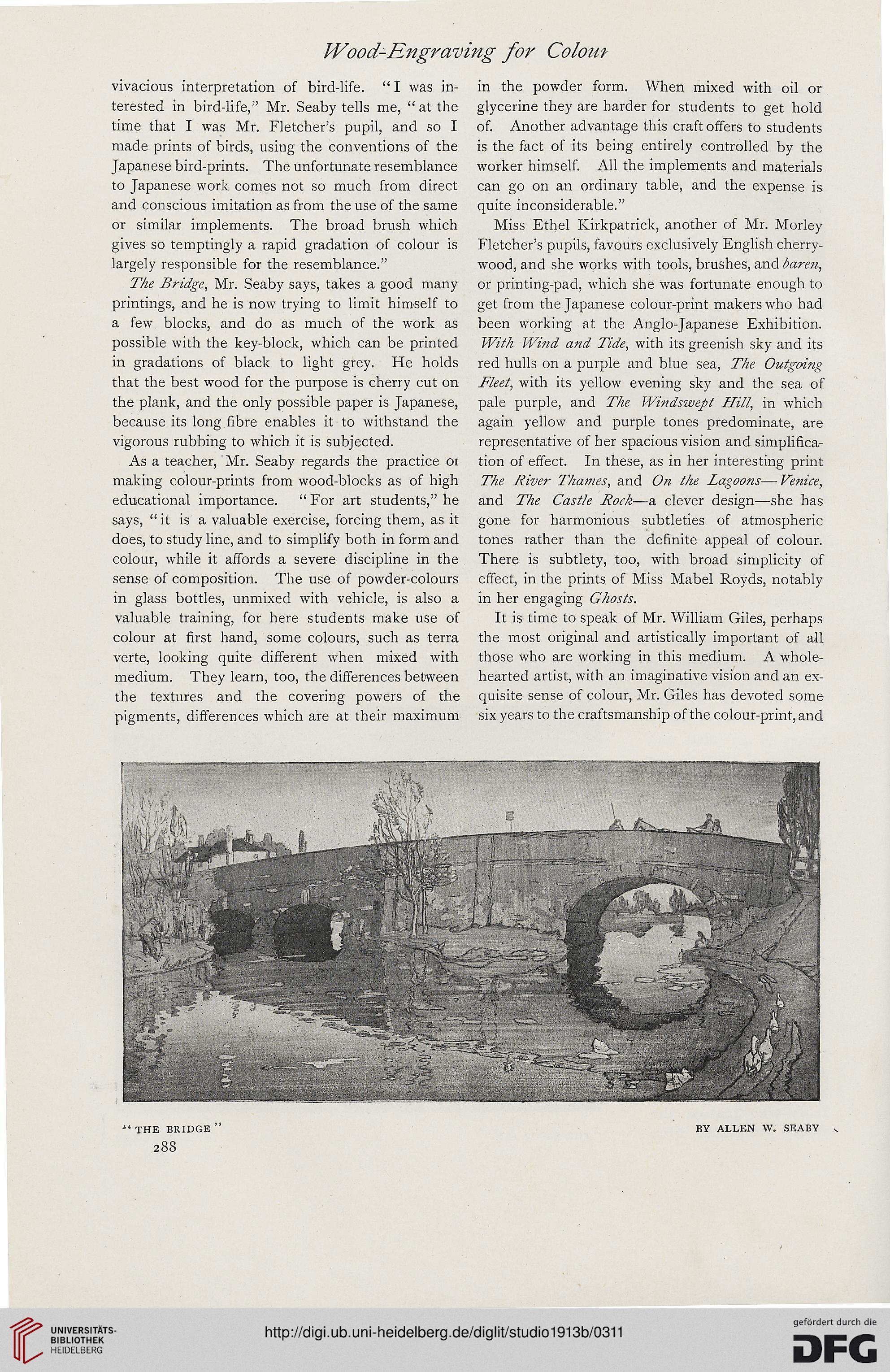
The Bridge, Mr. Seaby says, takes a good many
printings, and he is now trying to limit himself to
a few blocks, and do as much of the work as
possible with the key-block, which can be printed
in gradations of black to light grey. He holds
that the best wood for the purpose is cherry cut on
the plank, and the only possible paper is Japanese,
because its long fibre enables it to withstand the
vigorous rubbing to which it is subjected.
As a teacher, Mr. Seaby regards the practice 01
making colour-prints from wood-blocks as of high
educational importance. "For art students," he
says, "it is a valuable exercise, forcing them, as it
does, to study line, and to simplify both in form and
colour, while it affords a severe discipline in the
sense of composition. The use of powder-colours
in glass bottles, unmixed with vehicle, is also a
valuable training, for here students make use of
colour at first hand, some colours, such as terra
verte, looking quite different when mixed with
medium. They learn, too, the differences between
the textures and the covering powers of the
pigments, differences which are at their maximum
in the powder form. When mixed with oil or
glycerine they are harder for students to get hold
of. Another advantage this craft offers to students
is the fact of its being entirely controlled by the
worker himself. All the implements and materials
can go on an ordinary table, and the expense is
quite inconsiderable."
Miss Ethel Kirkpatrick, another of Mr. Morley
Fletcher's pupils, favours exclusively English cherry-
wood, and she works with tools, brushes, an&bare?i,
or printing-pad, which she was fortunate enough to
get from the Japanese colour-print makers who had
been working at the Anglo-Japanese Exhibition.
With Wind and Tide, with its greenish sky and its
red hulls on a purple and blue sea, The Outgoing
Fleet, with its yellow evening sky and the sea of
pale purple, and The Windswept Hill, in which
again yellow and purple tones predominate, are
representative of her spacious vision and simplifica-
tion of effect. In these, as in her interesting print
The River Thames, and On the Lagoons— Venice,
and The Castle Rock—a clever design—she has
gone for harmonious subtleties of atmospheric
tones rather than the definite appeal of colour.
There is subtlety, too, with broad simplicity of
effect, in the prints of Miss Mabel Royds, notably
in her engaging Ghosts.
It is time to speak of Mr. William Giles, perhaps
the most original and artistically important of all
those who are working in this medium. A whole-
hearted artist, with an imaginative vision and an ex-
quisite sense of colour, Mr. Giles has devoted some
six years to the craftsmanship of the colour-print, and
' THE BRIDGE
288
BY ALLEN W. SEABY
vivacious interpretation of bird-life. " I was in-
terested in bird-life," Mr. Seaby tells me, " at the
time that I was Mr. Fletcher's pupil, and so I
made prints of birds, using the conventions of the
Japanese bird-prints. The unfortunate resemblance
to Japanese work comes not so much from direct
and conscious imitation as from the use of the same
or similar implements. The broad brush which
gives so temptingly a rapid gradation of colour is
largely responsible for the resemblance."
The Bridge, Mr. Seaby says, takes a good many
printings, and he is now trying to limit himself to
a few blocks, and do as much of the work as
possible with the key-block, which can be printed
in gradations of black to light grey. He holds
that the best wood for the purpose is cherry cut on
the plank, and the only possible paper is Japanese,
because its long fibre enables it to withstand the
vigorous rubbing to which it is subjected.
As a teacher, Mr. Seaby regards the practice 01
making colour-prints from wood-blocks as of high
educational importance. "For art students," he
says, "it is a valuable exercise, forcing them, as it
does, to study line, and to simplify both in form and
colour, while it affords a severe discipline in the
sense of composition. The use of powder-colours
in glass bottles, unmixed with vehicle, is also a
valuable training, for here students make use of
colour at first hand, some colours, such as terra
verte, looking quite different when mixed with
medium. They learn, too, the differences between
the textures and the covering powers of the
pigments, differences which are at their maximum
in the powder form. When mixed with oil or
glycerine they are harder for students to get hold
of. Another advantage this craft offers to students
is the fact of its being entirely controlled by the
worker himself. All the implements and materials
can go on an ordinary table, and the expense is
quite inconsiderable."
Miss Ethel Kirkpatrick, another of Mr. Morley
Fletcher's pupils, favours exclusively English cherry-
wood, and she works with tools, brushes, an&bare?i,
or printing-pad, which she was fortunate enough to
get from the Japanese colour-print makers who had
been working at the Anglo-Japanese Exhibition.
With Wind and Tide, with its greenish sky and its
red hulls on a purple and blue sea, The Outgoing
Fleet, with its yellow evening sky and the sea of
pale purple, and The Windswept Hill, in which
again yellow and purple tones predominate, are
representative of her spacious vision and simplifica-
tion of effect. In these, as in her interesting print
The River Thames, and On the Lagoons— Venice,
and The Castle Rock—a clever design—she has
gone for harmonious subtleties of atmospheric
tones rather than the definite appeal of colour.
There is subtlety, too, with broad simplicity of
effect, in the prints of Miss Mabel Royds, notably
in her engaging Ghosts.
It is time to speak of Mr. William Giles, perhaps
the most original and artistically important of all
those who are working in this medium. A whole-
hearted artist, with an imaginative vision and an ex-
quisite sense of colour, Mr. Giles has devoted some
six years to the craftsmanship of the colour-print, and
' THE BRIDGE
288
BY ALLEN W. SEABY