

DOI issue:
No. 47 (February, 1897)
DOI article:Strange, Edward F.: A Spanish writing book of the sixteenth century
DOI Page / Citation link:https://doi.org/10.11588/diglit.18388#0060


A Spanish Writing Book
•ctettaoeoedon*
"S)oiiiincDoniiii'
n offer qua mad*
miiabileeffnoiri
diurn ijn vni ucifa
terra G^Qifecece*
flan Ibiiqelp*
efcreuia erilSSa-
P2id.fLrio(Xi(7o
explained, at a consistent angle to the line of
writing. But in the letra bastarda, each thick-
ness represents a change in the relative position of
the pen-point; a somewhat similar result to the
former being thus obtained by the linking-up of
successive complete strokes. It may perhaps illus-
trate my meaning to say that the very precise and
somewhat long-winded directions given by Lucas
for the making of the a in this character, require
specifically four several movements of the pen.
With this explanatory note on technique, we
can pass to a brief consideration of the examples
reproduced.
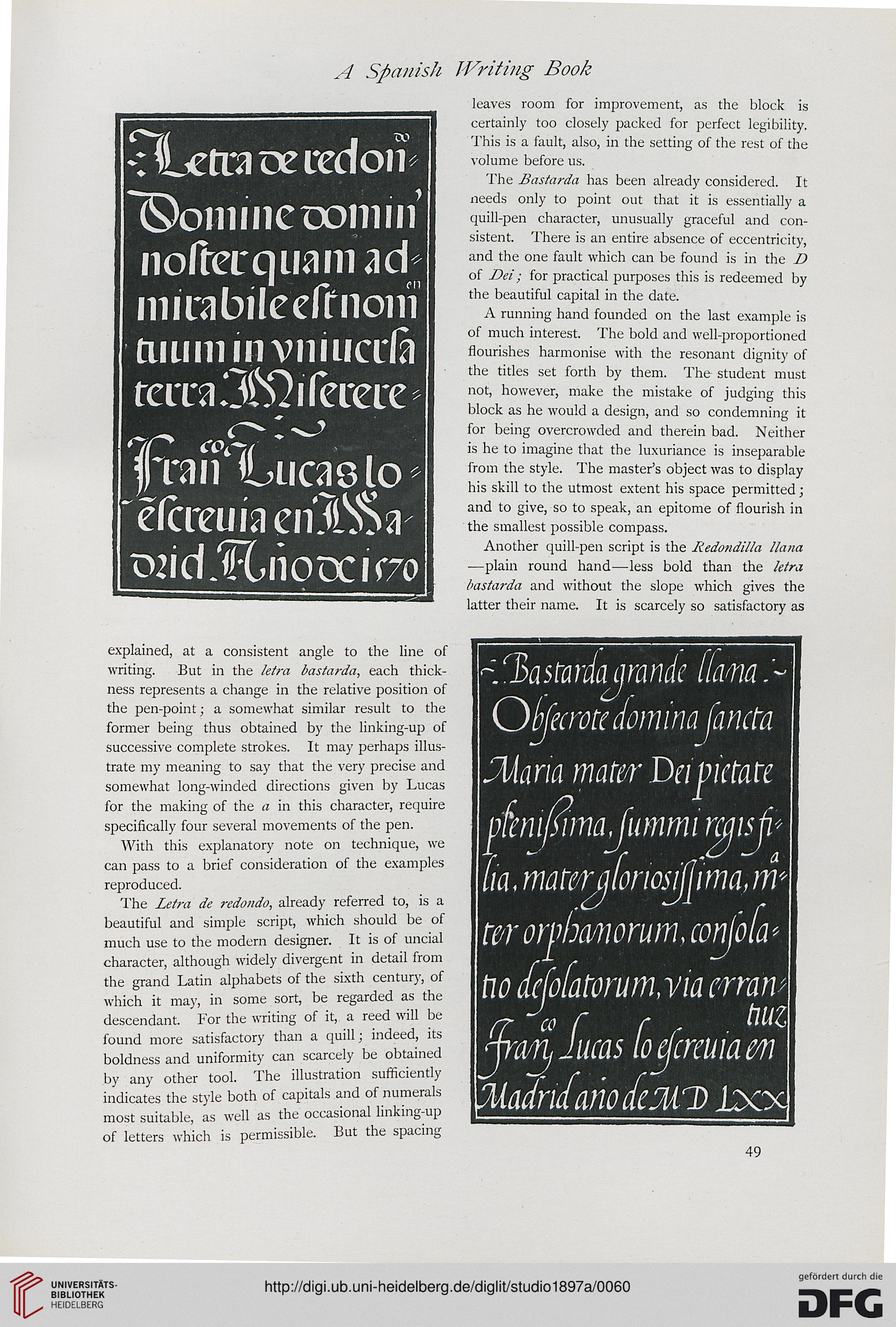
The Letra de redondo, already referred to, is a
beautiful and simple script, which should be of
much use to the modern designer. It is of uncial
character, although widely divergent in detail from
the grand Latin alphabets of the sixth century, of
which it may, in some sort, be regarded as the
descendant. For the writing of it, a reed will be
found more satisfactory than a quill; indeed, its
boldness and uniformity can scarcely be obtained
by any other tool. The illustration sufficiently
indicates the style both of capitals and of numerals
most suitable, as well as the occasional linking-up
of letters which is permissible. But the spacing
leaves room for improvement, as the block is
certainly too closely packed for perfect legibility.
This is a fault, also, in the setting of the rest of the
volume before us.
The Bastarda has been already considered. It
needs only to point out that it is essentially a
quill-pen character, unusually graceful and con-
sistent. There is an entire absence of eccentricity,
and the one fault which can be found is in the D
of Dei; for practical purposes this is redeemed by
the beautiful capital in the date.
A running hand founded on the last example is
of much interest. The bold and well-proportioned
flourishes harmonise with the resonant dignity of
the titles set forth by them. The student must
not, however, make the mistake of judging this
block as he would a design, and so condemning it
for being overcrowded and therein bad. Neither
is he to imagine that the luxuriance is inseparable
from the style. The master's object was to display
his skill to the utmost extent his space permitted;
and to give, so to speak, an epitome of flourish in
the smallest possible compass.
Another quill-pen script is the Redo?idilla liana
—plain round hand—less bold than the letra
bastarda and without the slope which gives the
latter their name. It is scarcely so satisfactory as
^3astardajmnde flam.-
Offecrottfanina fancta
SUana mater Dapictate
^mifimajimmir^isji*
tia, materjjforiosiflima, m*
t&r orpha/norum, conjbfa*
ho Icjo(atorumMa erttiw
^ra^Iucas (oejcreuiavn
MadrufariocfeMD Jdoc
•ctettaoeoedon*
"S)oiiiincDoniiii'
n offer qua mad*
miiabileeffnoiri
diurn ijn vni ucifa
terra G^Qifecece*
flan Ibiiqelp*
efcreuia erilSSa-
P2id.fLrio(Xi(7o
explained, at a consistent angle to the line of
writing. But in the letra bastarda, each thick-
ness represents a change in the relative position of
the pen-point; a somewhat similar result to the
former being thus obtained by the linking-up of
successive complete strokes. It may perhaps illus-
trate my meaning to say that the very precise and
somewhat long-winded directions given by Lucas
for the making of the a in this character, require
specifically four several movements of the pen.
With this explanatory note on technique, we
can pass to a brief consideration of the examples
reproduced.
The Letra de redondo, already referred to, is a
beautiful and simple script, which should be of
much use to the modern designer. It is of uncial
character, although widely divergent in detail from
the grand Latin alphabets of the sixth century, of
which it may, in some sort, be regarded as the
descendant. For the writing of it, a reed will be
found more satisfactory than a quill; indeed, its
boldness and uniformity can scarcely be obtained
by any other tool. The illustration sufficiently
indicates the style both of capitals and of numerals
most suitable, as well as the occasional linking-up
of letters which is permissible. But the spacing
leaves room for improvement, as the block is
certainly too closely packed for perfect legibility.
This is a fault, also, in the setting of the rest of the
volume before us.
The Bastarda has been already considered. It
needs only to point out that it is essentially a
quill-pen character, unusually graceful and con-
sistent. There is an entire absence of eccentricity,
and the one fault which can be found is in the D
of Dei; for practical purposes this is redeemed by
the beautiful capital in the date.
A running hand founded on the last example is
of much interest. The bold and well-proportioned
flourishes harmonise with the resonant dignity of
the titles set forth by them. The student must
not, however, make the mistake of judging this
block as he would a design, and so condemning it
for being overcrowded and therein bad. Neither
is he to imagine that the luxuriance is inseparable
from the style. The master's object was to display
his skill to the utmost extent his space permitted;
and to give, so to speak, an epitome of flourish in
the smallest possible compass.
Another quill-pen script is the Redo?idilla liana
—plain round hand—less bold than the letra
bastarda and without the slope which gives the
latter their name. It is scarcely so satisfactory as
^3astardajmnde flam.-
Offecrottfanina fancta
SUana mater Dapictate
^mifimajimmir^isji*
tia, materjjforiosiflima, m*
t&r orpha/norum, conjbfa*
ho Icjo(atorumMa erttiw
^ra^Iucas (oejcreuiavn
MadrufariocfeMD Jdoc