

DOI Heft:
Nr. 116 (November 1902)
DOI Artikel:Vallance, Aymer: Designs for book-plates: some remarks upon the result of competition B XX.
DOI Seite / Zitierlink:https://doi.org/10.11588/diglit.19877#0134


Designs for Book-plates
the emblem of one's namesake in the kalendar; ugly lettering. Not that it is to be inferred
or again it may be merely a monogram, like that that all the divers specimens of lettering here
by "Isca," which is at once ornamental and reproduced are suitable models for imitation.
For example, hollow ghosts of letters, like those
in "O Mimosa San's" drawing, are very faulty.
Their meagre effect is aggravated by their being
conglomerated together continuously without de-
marcation lines between one letter and another.
Not much preferable is the rendering of the
word li77ieum" in "Nemo's" design; and why
is the possessive pronoun in the neuter gender
when it should agree with masculine liber ? Again,
artificial shading, giving as it does the false appear-
ance of relief, and particularly any distortion of
letters in varying heights to make them fit into
spandrils, as in the case of "Alex's" design, or
into other irregular spaces, where the top and
bottom lines are not parallel, is a practice to be
condemned and avoided.
book-plate by " isca " It is not possible to lay down a rule to apply
universally, but at any rate
it is true to say that letter-
effective. In any event it /<*>2^^Cg^^^ * * _^ ing is commonly liable to
must be understood that /'/^R9nS)^(S^35''5z^~^\'^ ^e t0° ugnt an<^ lmn '"or
such marks or badges as / r^-^/)/|^^*^^^yr-r^ I J JhJ its place. There are, of
these constitute a large VS^E^^VaI fwnfcVi^l V^t course, plenty of instances
class, apart and distinct TwififiZtm It^vHn mwl where a dainty design would
fancy subjects with figures. yJv^C^. ^S^^V^ftv Qif mS > but, even so, the ad-
These latter compositions, lliZ^Lw — ~_Jj(ll vantage of contrast is such
however attractive in them- J jmj) fW-J'^iS?^ fe^f [ tnat solidity and blackness
selves, do not necessarily Mj&fcZ^mcSl H IftV 01 letters are more likely
suggest a book-plate, and ^V v ^&*Jly than not to improve a
might, suppose the lettering design. Square-built letters
were removed, serve for book-plate by " isca gjve an impression of firm-
almost any purpose from
menus, or birthday and invitation
cards, to tail-pieces for printed
books. One word, by the way,
concerning the expression ex libris.
As everybody knows, the "x" before
a consonant is strictly incorrect ;
but as in the case of ex cathedra,
usage has imparted a quasi-idiomatic
sanction to an otherwise anomalous
form of expression.
And here it is necessary to em-
phasise the importance of treating
the lettering, wherever it is intro-
duced, as an integral and harmo-
nious part of the whole composition.
Many a design, otherwise meritorious
enough, is marred to the extent
of disqualification by feeble or book-plate by "malvolio"
122
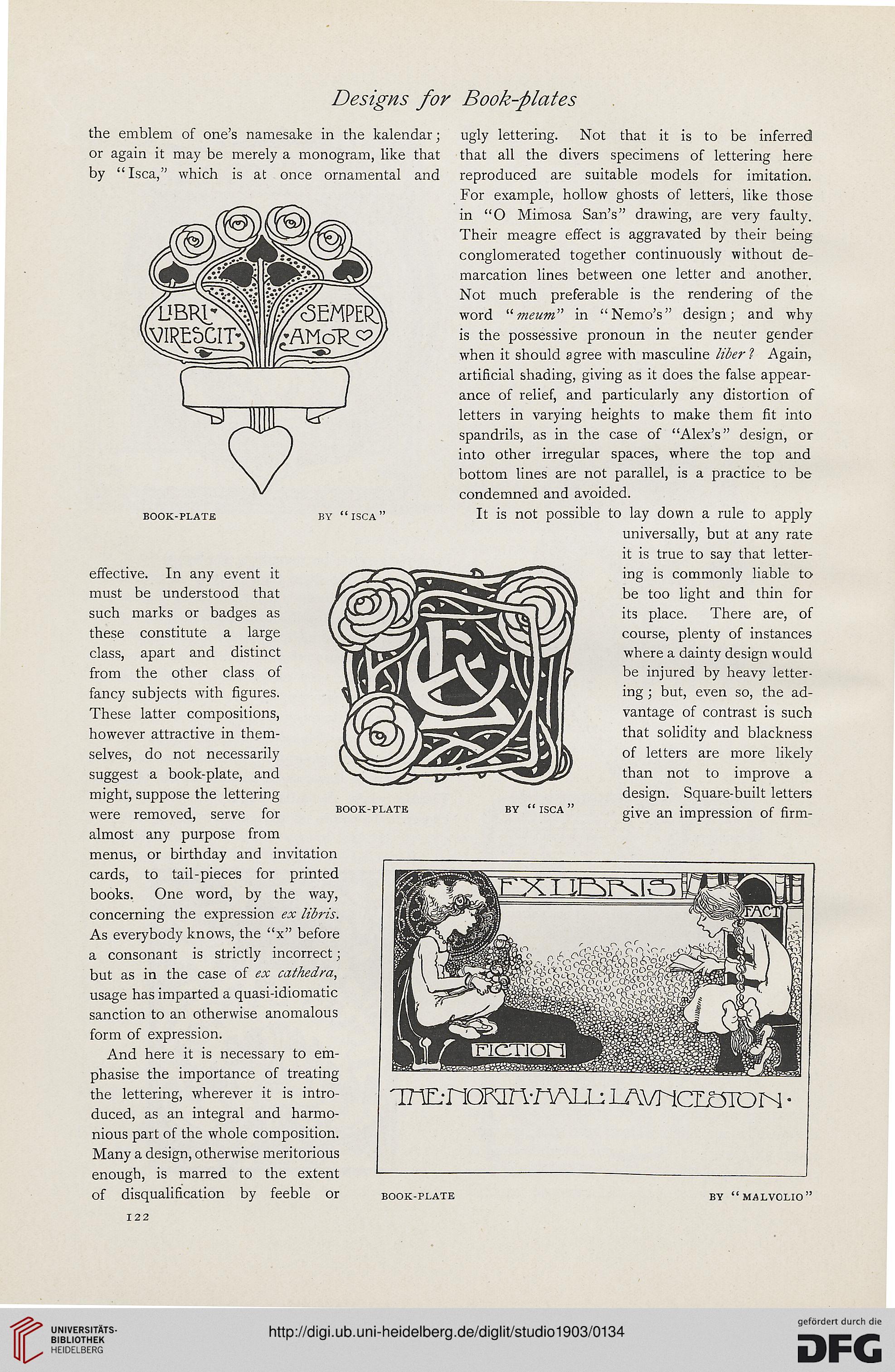
Tm-nOKin-nALL: lAVnciOTOIN
the emblem of one's namesake in the kalendar; ugly lettering. Not that it is to be inferred
or again it may be merely a monogram, like that that all the divers specimens of lettering here
by "Isca," which is at once ornamental and reproduced are suitable models for imitation.
For example, hollow ghosts of letters, like those
in "O Mimosa San's" drawing, are very faulty.
Their meagre effect is aggravated by their being
conglomerated together continuously without de-
marcation lines between one letter and another.
Not much preferable is the rendering of the
word li77ieum" in "Nemo's" design; and why
is the possessive pronoun in the neuter gender
when it should agree with masculine liber ? Again,
artificial shading, giving as it does the false appear-
ance of relief, and particularly any distortion of
letters in varying heights to make them fit into
spandrils, as in the case of "Alex's" design, or
into other irregular spaces, where the top and
bottom lines are not parallel, is a practice to be
condemned and avoided.
book-plate by " isca " It is not possible to lay down a rule to apply
universally, but at any rate
it is true to say that letter-
effective. In any event it /<*>2^^Cg^^^ * * _^ ing is commonly liable to
must be understood that /'/^R9nS)^(S^35''5z^~^\'^ ^e t0° ugnt an<^ lmn '"or
such marks or badges as / r^-^/)/|^^*^^^yr-r^ I J JhJ its place. There are, of
these constitute a large VS^E^^VaI fwnfcVi^l V^t course, plenty of instances
class, apart and distinct TwififiZtm It^vHn mwl where a dainty design would
fancy subjects with figures. yJv^C^. ^S^^V^ftv Qif mS > but, even so, the ad-
These latter compositions, lliZ^Lw — ~_Jj(ll vantage of contrast is such
however attractive in them- J jmj) fW-J'^iS?^ fe^f [ tnat solidity and blackness
selves, do not necessarily Mj&fcZ^mcSl H IftV 01 letters are more likely
suggest a book-plate, and ^V v ^&*Jly than not to improve a
might, suppose the lettering design. Square-built letters
were removed, serve for book-plate by " isca gjve an impression of firm-
almost any purpose from
menus, or birthday and invitation
cards, to tail-pieces for printed
books. One word, by the way,
concerning the expression ex libris.
As everybody knows, the "x" before
a consonant is strictly incorrect ;
but as in the case of ex cathedra,
usage has imparted a quasi-idiomatic
sanction to an otherwise anomalous
form of expression.
And here it is necessary to em-
phasise the importance of treating
the lettering, wherever it is intro-
duced, as an integral and harmo-
nious part of the whole composition.
Many a design, otherwise meritorious
enough, is marred to the extent
of disqualification by feeble or book-plate by "malvolio"
122
Tm-nOKin-nALL: lAVnciOTOIN