

DOI Heft:
Nr. 166 (December, 1910)
DOI Artikel:Laurvik, J. Nilsen: The Third Annual Exhibition of Advertising Art in the galleries of the National Arts Club
DOI Seite / Zitierlink:https://doi.org/10.11588/diglit.19869#0207


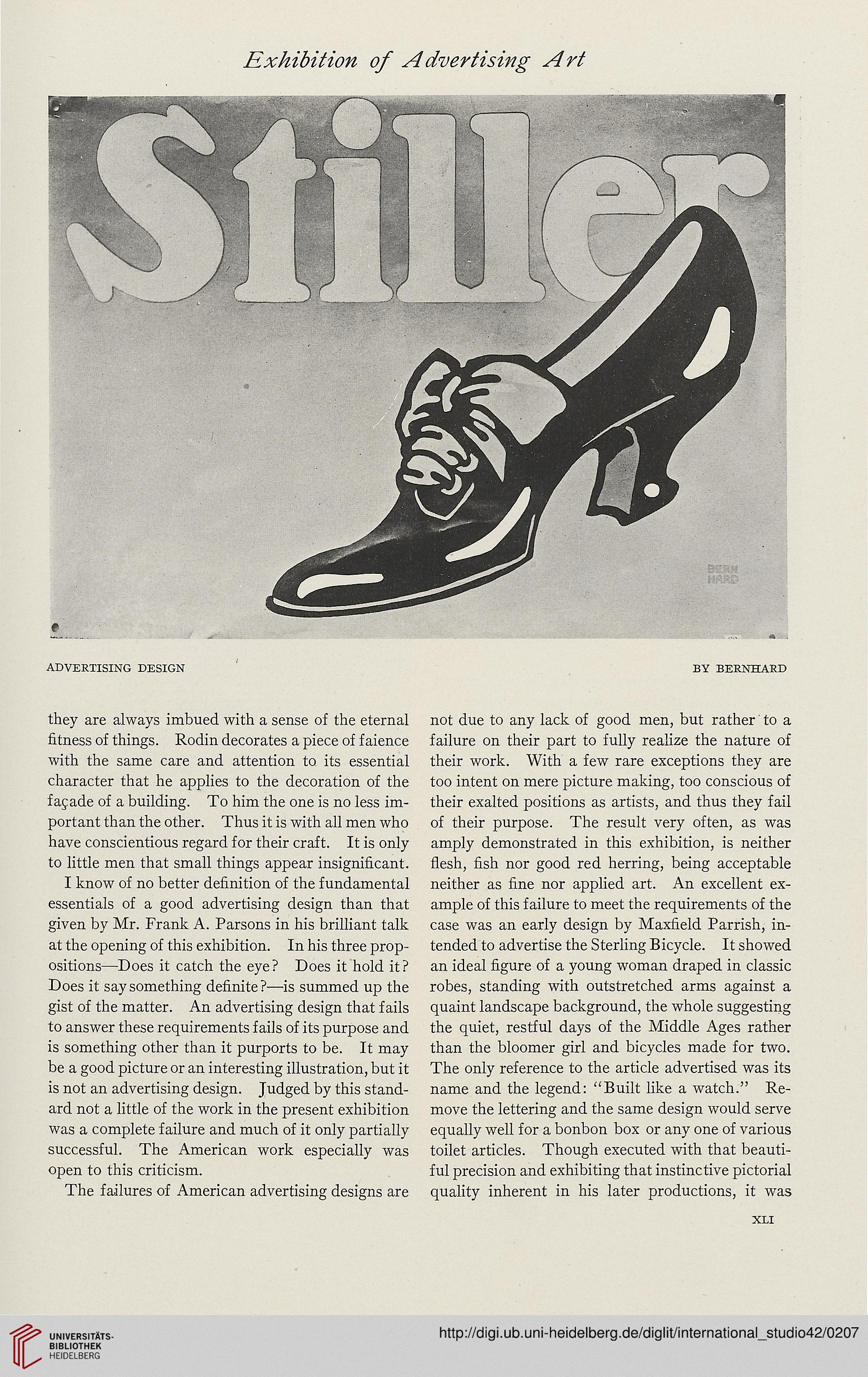
ADVERTISING DESIGN BY BERNHARD
they are always imbued with a sense of the eternal
fitness of things. Rodin decorates a piece of faience
with the same care and attention to its essential
character that he applies to the decoration of the
facade of a building. To him the one is no less im-
portant than the other. Thus it is with all men who
have conscientious regard for their craft. It is only
to little men that small things appear insignificant.
I know of no better definition of the fundamental
essentials of a good advertising design than that
given by Mr. Frank A. Parsons in his brilliant talk
at the opening of this exhibition. In his three prop-
ositions—Does it catch the eye? Does it hold it?
Does it say something definite ?—is summed up the
gist of the matter. An advertising design that fails
to answer these requirements fails of its purpose and
is something other than it purports to be. It may
be a good picture or an interesting illustration, but it
is not an advertising design. Judged by this stand-
ard not a little of the work in the present exhibition
was a complete failure and much of it only partially
successful. The American work especially was
open to this criticism.
The failures of American advertising designs are
not due to any lack of good men, but rather' to a
failure on their part to fully realize the nature of
their work. With a few rare exceptions they are
too intent on mere picture making, too conscious of
their exalted positions as artists, and thus they fail
of their purpose. The result very often, as was
amply demonstrated in this exhibition, is neither
flesh, fish nor good red herring, being acceptable
neither as fine nor applied art. An excellent ex-
ample of this failure to meet the requirements of the
case was an early design by Maxfield Parrish, in-
tended to advertise the Sterling Bicycle. It showed
an ideal figure of a young woman draped in classic
robes, standing with outstretched arms against a
quaint landscape background, the whole suggesting
the quiet, restful days of the Middle Ages rather
than the bloomer girl and bicycles made for two.
The only reference to the article advertised was its
name and the legend: "Built like a watch." Re-
move the lettering and the same design would serve
equally well for a bonbon box or any one of various
toilet articles. Though executed with that beauti-
ful precision and exhibiting that instinctive pictorial
quality inherent in his later productions, it was
XLI