

DOI issue:
Nr. 166 (December, 1910)
DOI article:Laurvik, J. Nilsen: The Third Annual Exhibition of Advertising Art in the galleries of the National Arts Club
DOI Page / Citation link:https://doi.org/10.11588/diglit.19869#0208


Exhibition of Advertisittg Art
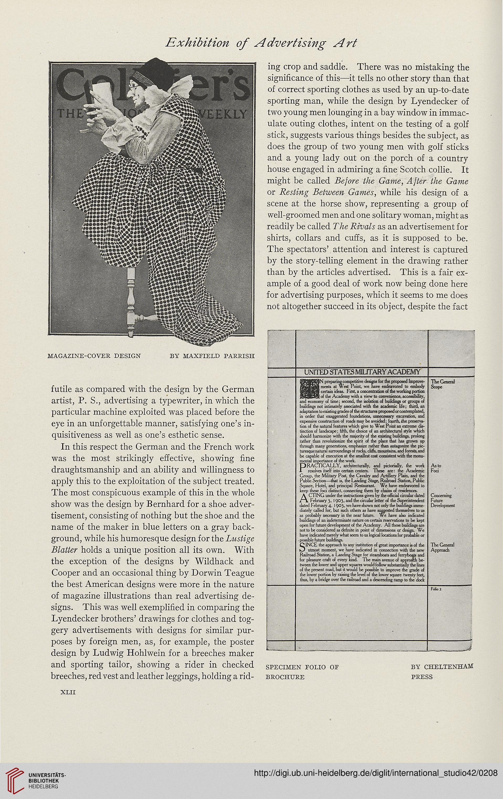
magazine-cover design by MAXF1ELD parrish
futile as compared with the design by the German
artist, P. S., advertising a typewriter, in which the
particular machine exploited was placed before the
eye in an unforgettable manner, satisfying one's in-
quisitiveness as well as one's esthetic sense.
In this respect the German and the French work
was the most strikingly effective, showing fine
draughtsmanship and an ability and willingness to
apply this to the exploitation of the subject treated.
The most conspicuous example of this in the whole
show was the design by Bernhard for a shoe adver-
tisement, consisting of nothing but the shoe and the
name of the maker in blue letters on a gray back-
ground, while his humoresque design for the Lustige
Blatter holds a unique position all its own. With
the exception of the designs by Wildhack and
Cooper and an occasional thing by Dorwin Teague
the best American designs were more in the nature
of magazine illustrations than real advertising de-
signs. This was well exemplified in comparing the
Lyendecker brothers' drawings for clothes and tog-
gery advertisements with designs for similar pur-
poses by foreign men, as, for example, the poster
design by Ludwig Hohlwein for a breeches maker
ing crop and saddle. There was no mistaking the
significance of this—it tells no other story than that
of correct sporting clothes as used by an up-to-date
sporting man, while the design by Lyendecker of
two young men lounging in a bay window in immac-
ulate outing clothes, intent on the testing of a golf
stick, suggests various things besides the subject, as
does the group of two young men with golf sticks
and a young lady out on the porch of a country
house engaged in admiring a fine Scotch collie. It
might be called Before the Game, After the Game
or Resting Between Games, while his design of a
scene at the horse show, representing a group of
well-groomed men and one solitary woman, might as
readily be called The Rivals as an advertisement for
shirts, collars and cuffs, as it is supposed to be.
The spectators' attention and interest is captured
by the story-telling element in the drawing rather
than by the articles advertised. This is a fair ex-
ample of a good deal of work now being done here
for advertising purposes, which it seems to me does
not altogether succeed in its object, despite the fact
UNITED STATES MILITARY ACADEMY
preparing competitive designs for the proposed Improve-
ments at West Point, we nave endeavored to embody
certain ideas. First, a concentration of the working portion
___lot the Academy with a view to convenience, accessibility,
and economy of time; second, the isolation of buildings or groups of
buildings not intimately associated with the academic life; third, an
adaptation to existing grades of the structures proposed or contemplated,
in order that exaggerated foundations, unnecessary excavation, and
expensive construction of roads may be avoided; fourth, the preserva-
tion of the natural features which give to West Point an extreme dis-
tinction of landscape; fifth, the choice of an architectural style which
should harmonize with the majority of the existing buildings, prolong
rather llian revolutionize the spirit of the place thai has grown up
through many generations, emphasize rather than antagonize the pic-
ture^ ue natural surroundings of rocks, cliffs, mountains, and forests, and
be capable of execution at the smallest cost consistent with the monu-
mental importance of the work.
PRACTICALLY, architecturally, and pictorially, the work
resolves itself into certain centers. These ore: the Academic
Group, the Military Post, the Cavalry and Artillery Plain, and the
Public Section—that is. the Landing Stage, Railroad Station, Public
Square, Hotel, and principal Restaurant We have endeavored to
keep these foci distinct, connecting them by chains of residences.
ACTING under the instructions given by the official circular dated
February 3, 1903, and the circular letter of the Superintendent
dated February 4, 19°3i we have shown not only the buildings imme-
diately called for, but such others as have suggested themselves to us
as probably necessary in the near future. We have also indicated
buildings or an indeterminate nature on certain reservations to be kept
open for future development of the Academy. All these buildings are
not to be considered as definite in point of dimensions or design. We
have indicated merely what seem to us logical locations for probable or
. possible future buildings.
f^lNCE the approach to any institution of great importance is of the
utmost moment, we have indicated in connection with the
Railroad Station, a Landing Stage for steamboats and ferryboats and
for pleasure craft of every kind. The main avenue of approach be-
tween the lower and upper squares would follow substantially the I'
ii the present road, but it would l>c possible to improve the grade of
the lower portion by raising the level of the lower square twenty feet,
thus, by a bridge over the railroad and a descending ramp to the dock
The General
Scope
As to
Foci
Concerning
Future
Development
The General
Approach
and sporting tailor, showing a rider in checked specimen polio or by Cheltenham
breeches, red vest and leather leggings, holding a rid- brochure press
xlii