

DOI issue:
The International Studio (March, 1908)
DOI article:Practical bookbinding, [6]
DOI Page / Citation link:https://doi.org/10.11588/diglit.28254#0402


Practical Bookbinding
PRACTICAL BOOKBINDING—VI.
(CONCLUDED)
BY MORRIS LEE KING
11 Striking” the tool {concluded): When
a tool has been impressed in the wrong place, or
when an impression has been badly “doubled,”
the matter may be rectified by wetting the leather
thoroughly with water or vinegar. After it is
thoroughly soaked raise the leather, point by
point, using for this purpose a pin mounted in a
thin wooden handle. Run the point in on an acute
slant always; never use a steel point, such as a
needle, as there is danger of the steel staining the
more delicate colored leathers. After the spot has
been raised it may be smoothed over with a flat
folder and allowed to dry and then blinded-in again.
If an impression is burned by an overheated
tool, it may not be possible to remedy the defect
except by setting in a fresh piece of leather. This
may sometimes be fitted to the impression, the
edges overlapping a bit; it may be necessary at
times to set in a larger piece extending to some
neighboring line, which, when tooled, will cover
the joint. At the same time, if the leather is not
burned deeply, it may be moistened, raised up as
well as possible and the tool carefully reimpressed;
it is sometimes surprising how good the result is.
In preparing a design and using it, the following
are the processes in sequence :
First—Lay out design with tools on thin, tough
paper.
Second—Blind-in design through the paper;
tools fairly hot.
Third—Reimpress the design, leather dry ; tools
fairly hot.
Fourth—Blind-in again, leather slightly moist;
tools warm only.
Fifth—Apply one coat of glaire and let dry.
Sixth—Pencil in oil, apply gold, impress tools.
Seventh—Glaire in again and repeat tooling.
Sequence in finishing: It is advisable to finish
the inside of the covers first. The book is laid
open on a finishing block (see illustration), a
weight firmly holding the cover to be finished.
The outside of each cover is next completed, the
book being open, face down, cover weighted, lying
on thick part of block. The edges and leather
over the head-band are next done, if they are to
have any decoration; the back should be done
last. For this the book is held, back up, in the
finishing press, between two pressing boards. The
latter should not come up high enough to inter-
fere with the full use of the finishing tools.
Lettering : The title and the name of the author
are the two things which are the most important
and to which the design used on the back should
be subordinated. The lettering should stand out
plainly and at the same time not be out of propor-
tion to the panel decoration.
As books vary much in thickness and as the
thinnest book may have a very voluminous title, it
often taxes the worker’s ingenuity to make a
harmonious arrangement. In very thin books it
may be found necessary to have no raised bands at
all, the title covering the whole length of the back
in a single line. In such cases, handle letters
should be used. The size of type used must, of
course, depend on the length of title and the thick-
ness of the back. As a rule, type of larger size may
be used in this style.
For an ordinary back (§ to i-f- inches) it is better
to break long wmrds or divide the title in several
lines, properly proportioned, thus using a larger
size type than would otherwise be the case. It is
customary to place the title in the second panel, the
author’s name in the third. Many binders, how-
ever, skip one panel and place the author’s name in
the fourth panel.
Often both title and name are placed in one
panel (second), as one well-filled and well-pro-
portioned panel is more decorative than two rather
scantily filled. This should, however, never be
done at a sacrifice of legibility. It may be accepted
that lettering on backs appears at its best when it
is laid out by taking a perpendicular line through
the center of the panel as a base line, the lettering
being equal in amount on both sides of the line.
Some binders begin all words near the left edge
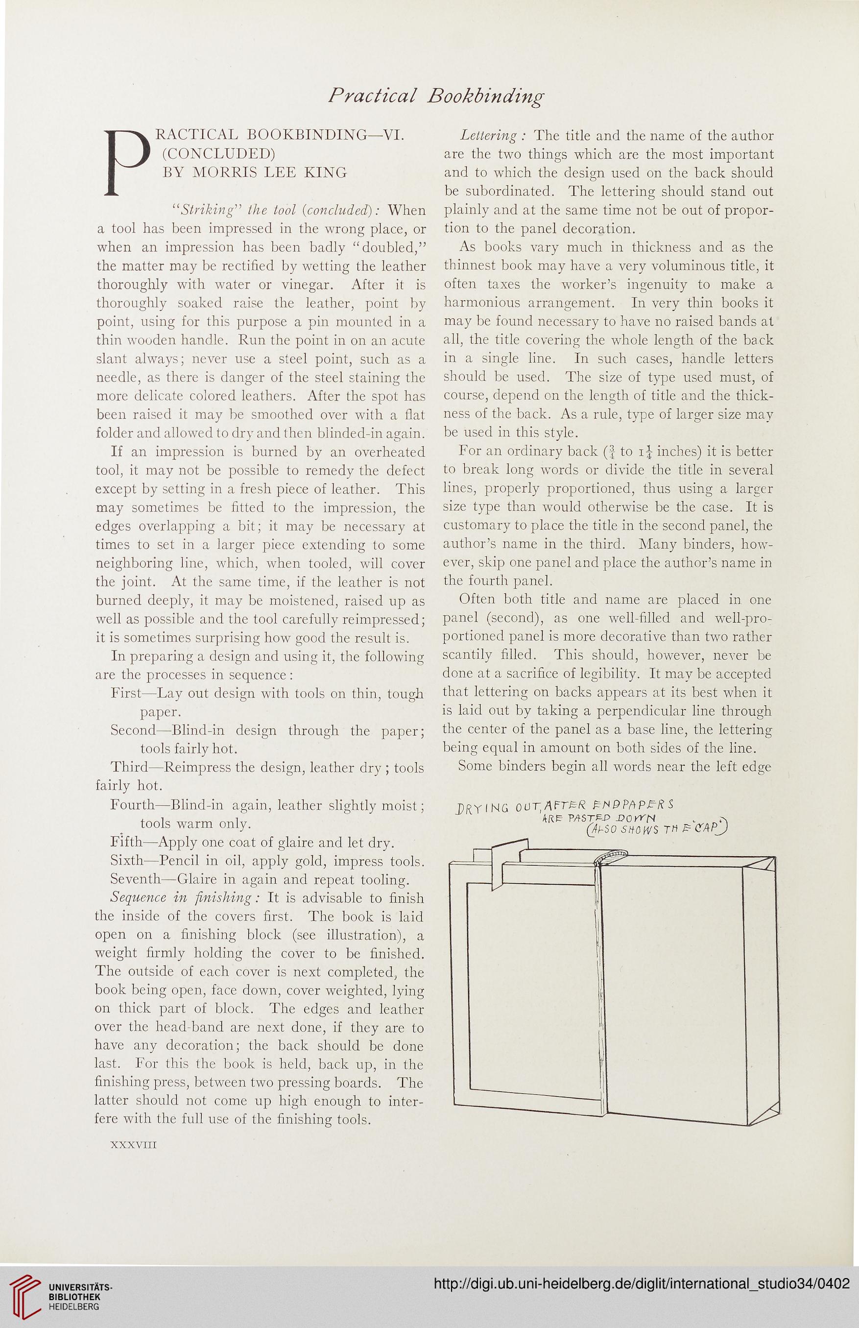
PRYING 00T, AFTER EM 9PAPER S
4RE? PASTJS-P -Dor^N . r\
(AhSO SHOWS TH E CAPJ
XXXVIII
PRACTICAL BOOKBINDING—VI.
(CONCLUDED)
BY MORRIS LEE KING
11 Striking” the tool {concluded): When
a tool has been impressed in the wrong place, or
when an impression has been badly “doubled,”
the matter may be rectified by wetting the leather
thoroughly with water or vinegar. After it is
thoroughly soaked raise the leather, point by
point, using for this purpose a pin mounted in a
thin wooden handle. Run the point in on an acute
slant always; never use a steel point, such as a
needle, as there is danger of the steel staining the
more delicate colored leathers. After the spot has
been raised it may be smoothed over with a flat
folder and allowed to dry and then blinded-in again.
If an impression is burned by an overheated
tool, it may not be possible to remedy the defect
except by setting in a fresh piece of leather. This
may sometimes be fitted to the impression, the
edges overlapping a bit; it may be necessary at
times to set in a larger piece extending to some
neighboring line, which, when tooled, will cover
the joint. At the same time, if the leather is not
burned deeply, it may be moistened, raised up as
well as possible and the tool carefully reimpressed;
it is sometimes surprising how good the result is.
In preparing a design and using it, the following
are the processes in sequence :
First—Lay out design with tools on thin, tough
paper.
Second—Blind-in design through the paper;
tools fairly hot.
Third—Reimpress the design, leather dry ; tools
fairly hot.
Fourth—Blind-in again, leather slightly moist;
tools warm only.
Fifth—Apply one coat of glaire and let dry.
Sixth—Pencil in oil, apply gold, impress tools.
Seventh—Glaire in again and repeat tooling.
Sequence in finishing: It is advisable to finish
the inside of the covers first. The book is laid
open on a finishing block (see illustration), a
weight firmly holding the cover to be finished.
The outside of each cover is next completed, the
book being open, face down, cover weighted, lying
on thick part of block. The edges and leather
over the head-band are next done, if they are to
have any decoration; the back should be done
last. For this the book is held, back up, in the
finishing press, between two pressing boards. The
latter should not come up high enough to inter-
fere with the full use of the finishing tools.
Lettering : The title and the name of the author
are the two things which are the most important
and to which the design used on the back should
be subordinated. The lettering should stand out
plainly and at the same time not be out of propor-
tion to the panel decoration.
As books vary much in thickness and as the
thinnest book may have a very voluminous title, it
often taxes the worker’s ingenuity to make a
harmonious arrangement. In very thin books it
may be found necessary to have no raised bands at
all, the title covering the whole length of the back
in a single line. In such cases, handle letters
should be used. The size of type used must, of
course, depend on the length of title and the thick-
ness of the back. As a rule, type of larger size may
be used in this style.
For an ordinary back (§ to i-f- inches) it is better
to break long wmrds or divide the title in several
lines, properly proportioned, thus using a larger
size type than would otherwise be the case. It is
customary to place the title in the second panel, the
author’s name in the third. Many binders, how-
ever, skip one panel and place the author’s name in
the fourth panel.
Often both title and name are placed in one
panel (second), as one well-filled and well-pro-
portioned panel is more decorative than two rather
scantily filled. This should, however, never be
done at a sacrifice of legibility. It may be accepted
that lettering on backs appears at its best when it
is laid out by taking a perpendicular line through
the center of the panel as a base line, the lettering
being equal in amount on both sides of the line.
Some binders begin all words near the left edge
PRYING 00T, AFTER EM 9PAPER S
4RE? PASTJS-P -Dor^N . r\
(AhSO SHOWS TH E CAPJ
XXXVIII